
I’m a product owner for DWP currently working on Universal Credit (UC). I’ve been working on a feature that supports a service for claimants to verify their details with work coaches before their claim can be processed. Our team has designed a 10-minute evidence gather which replaces a 60-minute interview.
The service is now live in every UC Jobcentre and processes more than 2,000 claimants per day. In its first six months the service saved more than 6,000 work coach hours (and that was in 2017 when UC was only in a small amount of offices). Our job is to make sure the feature fits seamlessly into the customer journey and works well for our users, the work coaches.
Making the feature simple to use
The success of the service relies on the Jobcentre gathering the correct evidence so that a decision maker can allow or disallow the claim for UC. The simple feature we designed involves work coaches asking claimants a small number of questions to remove the need for a separate lengthy interview.
One of our guiding principles was to make the feature as easy to use as possible. The less time users spend administrating the claim, the more time they would have to support people into work.
Trial periods allowed individual Jobcentres to work through any initial issues but when UC became available in every Jobcentre it became clear that despite have a clear and simple user journey, there was sometimes an issue with the information some work coaches needed to make a quick decision on the claim.
We faced an unexpected question: had making the service as simple as possible actually had unintended consequences?
Working with our users to fix the problem
We started talking to our work coaches to find out more. One of the main insights was some work coaches were struggling to record information accurately. I tracked 300 cases and more than 25% of them were completed without enough evidence for a decision. Further training did not solve the issue, so we had to look again into what might be the problem.
What we found was interesting. Our analysis showed work coaches were getting through the feature in an average of 104 seconds. We originally saw this as a positive, but crucially, they were not always getting the quality of information they needed to make a decision at the first attempt.
Adding extra questions was the answer
What we decided to do next went against our original principles. We added in extra questions to make it clearer what evidence the work coach should gather. We effectively made the user journey longer.
For example, users are able to make a quicker decision on a claimant who has ready evidence of their employment and earnings, typically accepted as 3 months. The less evidence they have, the more enquiries work coaches need to make.
User research had indicated that by having fewer questions but using supporting help text we could reduce the user journey. So this was the original question we included:
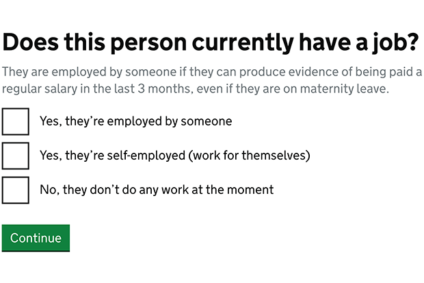
However, talking to our work coaches later on showed us that they did not always know how to answer this question if the claimant was working but did not have evidence of 3 months’ salary. We needed to make it clearer. So we replaced the question with the following 2 screens:
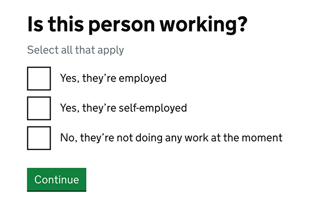
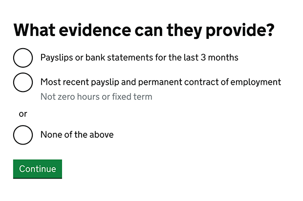
Adding another question meant that the work coach could answer honestly without relying on help text.
Analysing the impact of the change
A couple of weeks later I noticed that the journey time had actually decreased since we put the additional question in. By making things clearer the work coaches were able to navigate the pages more quickly and, despite adding additional questions, our overall journey time was shorter.
Work coaches were referring fewer people who did not have evidence of the 3 months of earnings, meaning more decisions could be made first time.
This was a brilliant outcome. When designing digital services for users, there’s an assumption that less is always more. But we learned not to assume that simplicity will lead to a shorter user journey. If people do not understand what you’re asking them, it will take longer and lead to people getting the wrong result.
It just reinforces the fact that ongoing user research is still so important once a product is live. Continuing to monitor performance and engaging with users to ensure that a product or service remains the best possible solution for your problem is crucial. We should always make sure that simplicity really does make things better for users.
Like this blog? Why not subscribe for more blogs like this? Sign up for email updates whenever new content is posted!
1 comment
Comment by Ikenna posted on
Interesting write up