I’m Catherine Hope and I lead the team of Digital Performance Analysts working in Newcastle on DWP’s retirement provision services. I’m also DWP’s Data Presentation Champion, and get very excited by charts!
I’m going to tell you about practising what we preach – applying an agile, iterative approach to the way we share data with teams.
Helping agile teams measure, learn and improve
Get your State Pension is a new service we’re building for citizens. It’s been in private beta since the end of January and we’ve invited over 3,500 people to use the online service so far. We’re helping the team measure things like the number of people using the online service, the amount of time it takes for them to apply and the pages where they drop out and leave the service. We use data to do all of this: gathering, analysing and sharing. Together with user research and customer feedback we can assess and continuously improve our services.
Using dashboards to share data
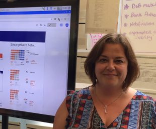
We share data in lots of different ways, through daily and weekly reports and using a dashboard we built using Google Analytics.
We’re really proud of our dashboard! It’s permanently displayed on a large screen so it’s nice and visible and it helps us keep track of what’s going on through the day. It’s a good talking point for visitors too.
When we started out, our dashboard displayed the number of people using the service right now (I know, cool, huh?!), what page people are currently on, and charts showing the number of completed applications to date – amongst other things.
Iterating our dashboard to meet evolving (team) needs
To begin with, it was really exciting to see when a user was accessing the online service. We watched the first user’s progress, willing them onto completion. We let out a cheer of success!
After the first handful of users, the novelty wore off and we began to think about how we could use the dashboard to show metrics that let the team learn what’s working well, what could be better and what we needed to improve.
We decided to take the same approach to improving our analytics as we would for any of our digital services: assessing, gathering evidence and looking at user needs.
The team and I were quite surprised by how much we do - we don’t just create reports from Google Analytics. We also pull in data from our operational colleagues, analyse user feedback scores, and report ‘take-up’ (proportion of people that use Get your State Pension out of those who don’t).
We agreed to keep the dashboard, but with some changes. For example we didn’t need the real-time stuff anymore. We liked seeing some trends for context, but we shortened the time frame and added the take-up visuals.
Our new (and improved) dashboard
We built our new dashboard in Google Data Studio, as it has several benefits over Google Analytics, and meant we could include data from operational and administrative systems.
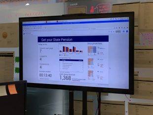
The new dashboard has a ‘Today so far’ section showing the number of people at key stages in the online journey (including completions) which is updated every five minutes. It also displays a trend chart and table showing comparisons to the previous week and a big counter of all completions since the service began.
We’ve had really positive feedback about it, and lots of people stop and look when they walk past. But the important thing is whether the team find it useful, and they all agreed the new dashboard is more useful and take-up is now easier to understand and explain to other people.
The average session duration is proving helpful to show a comparison to the current State Pension online service (ours is quicker). And the ‘Today so far’ section gives more context than the previous real time information. For example, we can see whether everyone who logged in managed to complete, or left part-way through.
I like that the infographic includes the calculation. People can see that the numbers aren’t just plucked out of thin air, and can see why they differ. One of the users said simply, “I do like the little men.”
That’s great. But it doesn’t mean we’re done. We’ll keep reviewing it, and all of our other products, iterating them to make sure they continue to meet the team’s needs. Because data has users, and those users have needs too.
We’re proud to work with data
For people who are passionate about data, DWP Digital has so many exciting opportunities. DWP recently won the Government Statistical Service Presentation and Dissemination prize.
If you’re thinking of a career with us, visit our DWP Digital Careers website and look at our LinkedIn page to see our latest jobs. Find out more about what's happening in DWP Digital: Subscribe to this blog and follow us on Twitter @DWPDigital.
2 comments
Comment by Martin Pickard posted on
great stuff Catherine, its good to see us making data useable to the non techy people
Comment by Vikas Dhawan posted on
Catherine - thank you for sharing your experiences and ideas. Found it useful.