I’m Steven Borthwick, an interaction designer on Check your State Pension. It’s a service that lets people see a forecast of the amount of State Pension they can expect to get when they retire.

I also work on behind-the-scenes services used by colleagues in Operations who deal with State Pension enquiries. I’ve noticed a lot of key differences working with 2 distinct user groups, so I wanted to round up what I’ve learned from designing services for DWP colleagues.
1. Civil servants are users too
Like any users, colleagues have emotional needs. They want the things they need to use to do their job to be quick and easy to use. They might want to deal with something quickly because they need to meet performance targets. They may be concerned about the security and the accuracy of the information they give. Above all they want to be as helpful as they can when someone gets in touch with a State Pension query.
2. Design for repetition and efficiency
Many GOV.UK services are used by large numbers of people, but each person often uses a service infrequently. For example, you might visit GOV.UK to renew your car tax once a year, or register to vote when you move house. Services are designed with this in mind. There is one thing per page and users are stepped through the process.
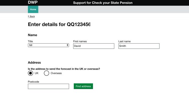
Colleagues using internal services want the quickest possible outcome, as long as it's accurate. We have followed the one thing per page principle but the ‘thing’ - the information someone needs - can be larger. For instance, all the personal details a colleague needs to fill in are on one page which lets them review and change things before continuing. Similarly, it's important for colleagues to easily access all the information they need to answer enquiries in one place.
We’ve also designed for repetition, because colleagues will be using the service many times a day and it needs to be as frictionless as possible.
3. Involve colleagues in the work
If colleagues use a service every day, they know what works and what doesn't. They sometimes find shortcuts for things they want to do, so it's useful to understand what they're trying to do so you can improve the service. We do this by gathering feedback, usability testing and analysing data. We let colleagues know when we've improved something so we can show we're listening to their feedback.
It's important to explain why the service is the way it is, especially if there's a reason it doesn’t work the way someone would prefer it to work. For instance, we took away some features that colleagues were used to in their old systems. Our research said there wasn't a need for it but we didn't explain this to our users.
This led to some frustration from colleagues, and sometimes the feeling that we were undermining their role. We learnt that it’s essential to keep communicating what you're changing and why, particularly if you can show it’s more efficient and therefore gives colleagues time to deliver a service that meets the needs of citizens.
4. People often prefer what’s familiar
We all get used to systems we work with every day. Some colleagues use them for years and become real experts. If you’re replacing systems with something new it can be hard to move on and there can be resistance to change. If an old system still exists people can go back to using it because it's familiar - even if it's more difficult to use.
This is something we have to be aware of in research. It’s why it's important to concentrate on what works and not what is popular.

5. Design an end-to-end service
We needed to be careful not to design internal services based on the previous processes for the sake of it. There are opportunities to change, automate or remove processes that aren't efficient or useful. This is where designing an end-to-end service is important: it helps you to think about it as a whole.
6. Don’t use jargon
Jargon and acronyms are common in the Civil Service. They can often only be understood by people who use them. As far as possible, internal services, like public-facing services, should be jargon-free. Otherwise, there's a risk that colleagues will use these terms with citizens. Always use language that can be easily understood by as many people as possible.
7. Training shouldn't be about how to use the service
Often people think you can solve usability issues in a colleague-facing service with training. While someone may need training on how State Pensions work, they should be able to use a service without instructions. If the service is simple to use colleagues will need minimal training to use it.
8. Design for everyone
Internal services need to be accessible. DWP is a diverse workplace with people who have different accessibility needs. Making a service accessible makes it easier for everybody to use. For instance, if someone relies on tabbing and keyboard shortcuts, it’s more helpful if they can get through a service without using a mouse.
Like public-facing services, internal services need to be designed to be responsive. Sometimes colleagues need to open other systems to compare information to make a decision. If a person needs to shrink a window on their computer screen, the information in that window should still be easy to see.
This is just a summary of what I’ve learnt about designing services for colleagues. It’s a good thing that we’re applying the same service standards, user research and design to internal services as we do for public-facing services. Doing this helps to design internal services that meet the needs of colleagues which helps them to support citizens.

Recent Comments