I’m Ashleigh Wilson and I’m an interaction designer at DWP Digital. I’m based in our new Manchester hub. I’m currently working on a new service to help landlords set up direct rent payments.

Framing the problem
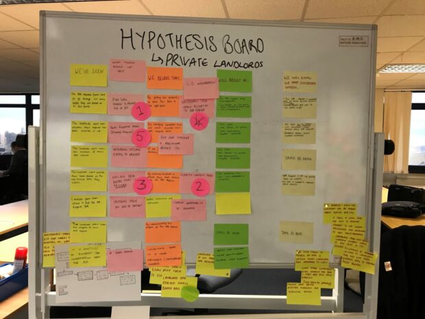
As part of our research in discovery, we spoke to landlords in a focus group and mapped out an end-to-end journey.
We used the focus group to find out issues relating to the application form process.
It was important to understand the blockers to using the service so that we could consider potential solutions.
Prioritising the main issues
After the focus group, we picked out the main pain points for landlords, and created a series of hypotheses. These were ideas about how we might reduce or remove that pain, which we then prioritised with our product owner.
Sharing features cross-government
In our research we discovered several ways to determine which application form the landlords would need to use based on factors such as postcode and email address.
With a tight deadline ahead, we knew that reusing a tested feature - a postcode checker by the Government Digital Service (GDS) - would be the best option. It was my job to quickly put together a prototype, while our front-end developer sourced the postcode checker from GDS. Then we were ready to test with our users.
In the prototype, the landlord entered their tenant’s postcode and was given the option of two forms and one email address to send it to. We put it in front of some landlords and soon realised that this was not enough. The postcode checker had filtered out which inbox the form needed to go to, but the research showed us that there was still confusion around which form to use, for example whether to use secure or non-secure.
In addition some people were not seeing the link to the form, or not seeing the email address, so we knew we had to iterate and do some more research.
Iterating and research
We thought about how we could cut out the options and give the landlord the right form and email address. After some internal brainstorming with the team, we came up with a simple solution: to ask them for their email address. So I designed a simple question format for the service asking the user about the format of their email address.
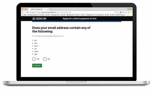
The testing went extremely well as the landlords knew straight away if these letters were in their email addresses or not - it didn’t matter if they knew what the abbreviations meant.
We also tested multiple variations of the final page which displays the outcome information, to make sure we were meeting the user needs and that they weren’t skipping past any information.
And we tested other designs, for example with and without numbering, to see if this helped users complete the steps. We also ran tests with and without the email link to see if users took the email address from the form, and also tested with and without the download icon.
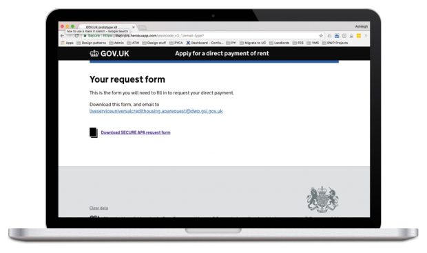
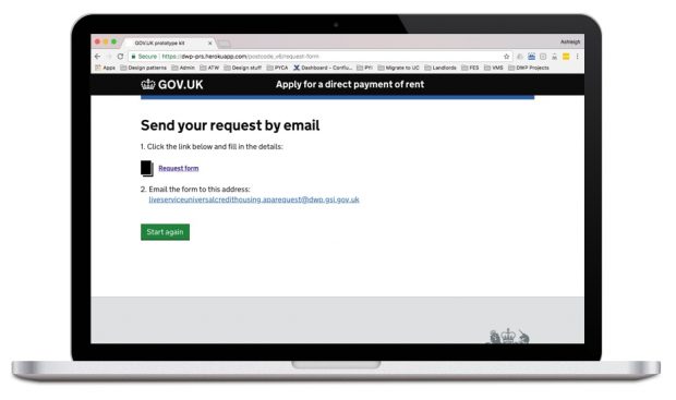
Even small design changes can have a great impact for the user and in DWP Digital the user is at the heart of everything we design. It can be the difference between a user doing it the correct way, or going back to their familiar ‘workarounds’.
Finally, we did it! And the Apply for a direct payment of rent service is now live. And as with all our services we’ll continue to iterate based on our users’ feedback, because a live service is not the end of the story!
DWP Digital is currently recruiting technology specialists. If you're interested in looking into the opportunities available, visit our DWP Digital Careers website and have a look at our LinkedIn page. You can also find out more about what's happening in DWP Digital by subscribing to this blog and following us on Twitter @DWPDigital.

Recent Comments