Back in December, Amy wrote on the GDS design notes blog about start pages within guides:
Lots of users navigate to start pages for services through content on GOV.UK, which means start pages repeat information they may already have read
Since then we’ve been working on improving the Carer’s Allowance content on GOV.UK – testing different design iterations in user research sessions.
What we discovered in research
In our user research, we discovered 2 clear user needs for the Carer’s Allowance guide on GOV.UK. Users want to know:
- what they're entitled to, and/or
- where and how to apply
We found that the amount of content about Carer’s Allowance on GOV.UK can be overwhelming so many people just want to start an application.
We also found that most people have common questions about whether they, their partner, or the person they care for, will be better or worse off if they get Carer’s Allowance.
Some users need detailed information, but most want a service that “just tells me what I need to know”. This is why people often prefer to speak to someone – they can get the information they need without having to read through everything.
Getting users to what they want quicker
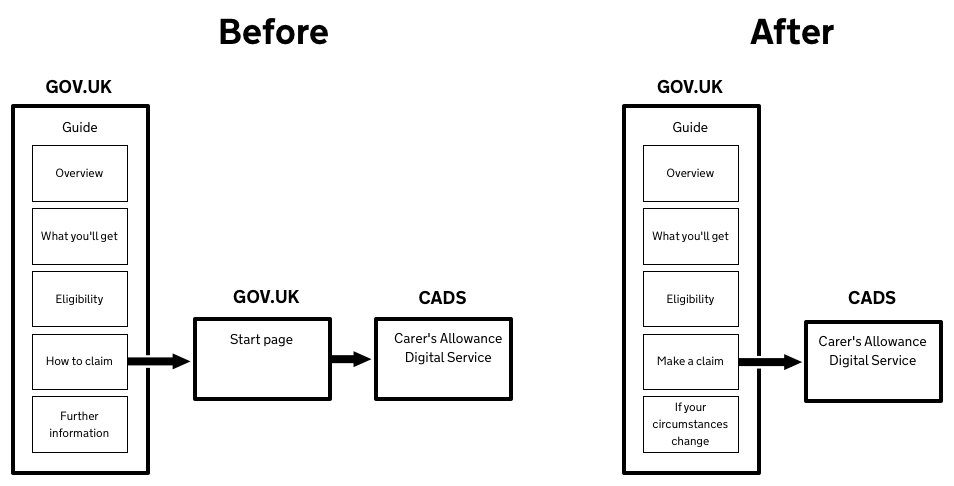
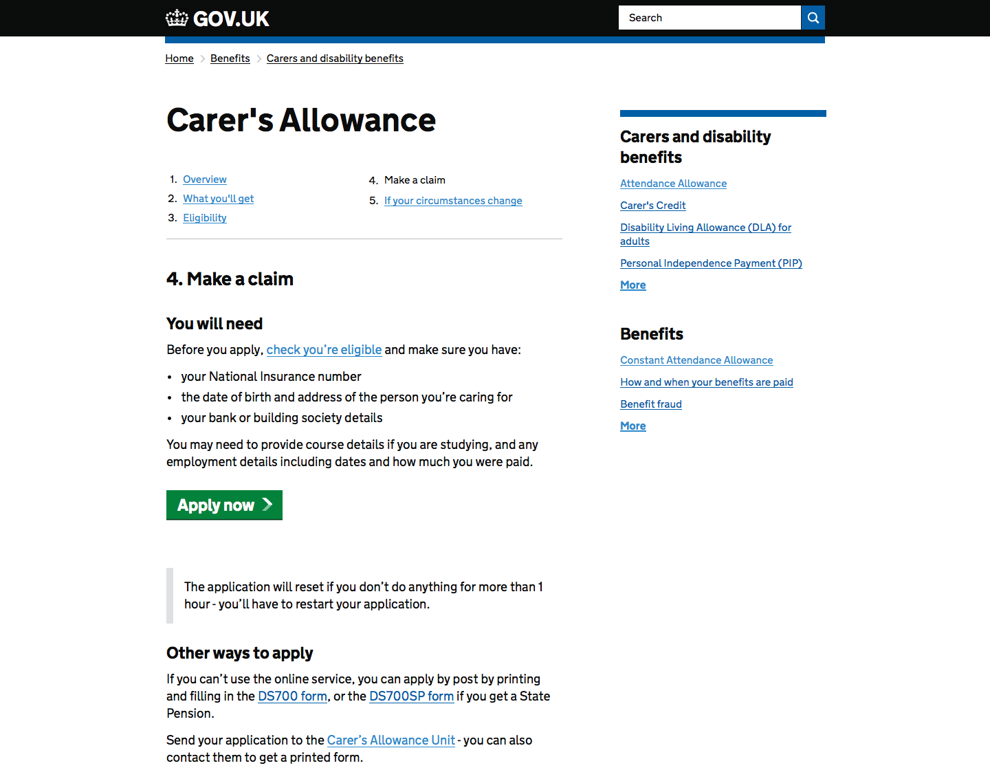
We’ve now implemented the design for a single ‘make a claim’ page in the guide.
There’s no longer a separate start page so users can navigate more clearly to ‘Apply now’. It means they can quickly find out if they are entitled to Carer’s Allowance by answering the eligibility questions in the application and access a helpline if they still need to speak to someone.
The old Carer’s Allowance guide was more digital?by?preference, than default. The new ‘make a claim’ page has more emphasis on the digital service because it’s simpler, clearer and faster to apply online.
Improving content
After testing different approaches for ‘you will need’ we found that we should just tell people about anything that could block their progress. For example, you need your National Insurance number or you can’t complete the transaction. In contrast, we previously said ‘details of benefits received’ but you only need to know that benefits are being received – you don’t need the details to enter.
We also found that eligibility needs to be signposted, but it doesn’t need to be part of ‘make a claim’. If people just want to start an application they then answer the eligibility questions.
What’s happened
These changes have now been live on GOV.UK since May. We’ve seen a significant increase in traffic to the service and a 22% increase in applications made online. More people than ever before are using the online service.
Next steps
We’re still testing and learning about the content in ‘make a claim’. Most of our research is now with less confident users who need reassurance that completing an application online is quick, easy and secure. We’re thinking about:
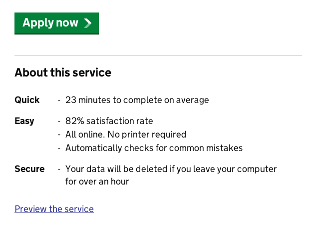
- Telling people that they don’t need a printer ? staff that speak to customers in the Carers Allowance Unit regularly hear that people expect to have to print to use the online service
- Telling people how long it will take them to complete an application online (using live data)
- Showing users the user satisfaction score for the Carer's Allowance online claim service


Recent Comments