I’m Ryan Dunn, Head of DWP’s Data Science hub in Newcastle. Here at DWP we’re driven by our motivation to change people’s lives, and it’s clear that better use of data can help us achieve that. That’s why I’m working closely with DWP strategy and policy to design data-driven products to support, inform and transform those areas. Data visualisation design has been an integral part of developing our products.
I’ve been working to build a data visualisation design community. It’s a great way for colleagues who share a passion for data visualisation to come together, share their learning and look for new ways of doing things.
Data visualisation is important - especially in government - as it allows relationships and trends in data to be seen in context and understood more easily. Through well-designed products we can enable those who develop and use our services to better understand our often complex data and continue to improve and make a difference to people’s lives.
Keeping pace
Data visualisation design is a fast-evolving field, largely due to the speed at which technology is advancing. To keep with the pace, we need to stay ahead of the trends in user experience, digital standards, accessibility, tools, techniques and knowledge of emerging research.
Unlike other roles in DWP Digital, there is no ‘Head of Data Visualisation’, nor a unit, division or centre which other disciplines have. That’s because data visualisation design spans the whole of DWP Digital, including teams involved in statistical publication, dashboard design, application development, user experience, communications and most aspects of analysis.
This makes it increasingly important to have an outlet where colleagues can ask and answer questions, share, debate and talk about the subject.
A sense of community
Communities of practice are nothing new in DWP Digital. We’ve already got some really active communities; from user research to business analysis, software engineering, statistics and more.
I’m excited to see our data visualisation community evolve. We’ve got people with a real passion for the field and who are building good reputations within their respective disciplines.
But building this community isn't about individuals. It’s about bringing people together to level everybody up; experiencing new techniques and tools, breaking down silos, connecting and creating, seeking and giving feedback, listening and learning.
I’m keen to provide a supportive and collaborative environment for us all to interact, share, teach and learn to grow the community so these individual contributions can lead to something collectively much bigger. The early signs are incredibly positive. Communities of practice like ours offer the chance to be the best we can be in our profession and help us achieve our goals.
Changing how we view things
Stephen Southern is a Data Scientist working in my Newcastle hub and recently attended a workshop delivered by some of the data visualisation design community.

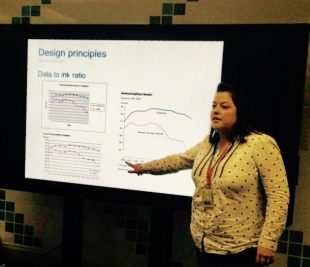
The workshop laid the foundations to understand the subject of data visualisation by walking attendees through the science and theory behind what’s effective - and in turn, what is usually less effective and should generally be avoided. It focused on understanding the audience and how much detail is needed to get your message across.
Stephen said, “During the workshop we broke into groups and worked through some 'makeovers'. We were given example tables and charts and asked how we could make them better - this sparked some interesting conversations, and also highlighted how even in a small group of likeminded people we all viewed the charts and data differently. We were then shown some ideas and options for making over these charts - ending with a simpler, clearer solution.
“There was a real buzz to the workshop which demonstrated the value of events like this in enabling us to continually improve the way we do things. Everyone who attended the workshop agreed they’d never look at a chart in the same way again!”
Staying ahead of the trends
One of our recent data visualisation community projects involved working with Catherine Hope from the Web Analytics team to completely redesign our statistics publications. The design was so successful it has now been adopted elsewhere across government.
Catherine said, “We’re continually looking at ways to improve our digital data products. Together with colleagues from the data visualisation design community I recently attended The Graphical Web conference - an annual, global conference showcasing best practice, new opportunities and future directions in the fast-changing world of data visualisation on the web.
“The conference allowed us to make connections with people from a variety of professions throughout the technology, data visualisation and graphics industries and academia who are working on similar things so that we can learn from them – and them from us.”
Being open
Adam Pearce works in our Statistical Services Division. He’s responsible for developing data visualisations to support our official and National Statistics publications.

Adam said, “I‘ve been looking at improving user understanding and engagement with our statistics through visualisations. To do this we have started building and releasing responsive, web-based, interactive data visualisations using open source technologies and making use of our own open data API”.
In DWP Digital we’re combining design-thinking, digital technology and rich data to create exciting and innovative products that open up our data. We’re committed to continually raising the bar to improve the user’s knowledge and experience.
Come join us
We’ve got lots of exciting work coming up and we’re looking for more technically innovative, creative thinkers with analytical minds that like a challenge. If this sounds like you, then come and join us.
Find out what opportunities there are in DWP Digital: Subscribe to this blog to discover more about what's happening in DWP Digital, follow us on Twitter @DWPDigital, and view our latest jobs offers.
6 comments
Comment by Lewis Mills posted on
Sounds great: were there slides from the workshop? Can you post them (or a version of them) so we can get some ideas?
Comment by Stephen Southern posted on
Hi Lewis, we are currently refining the training material and working to make it available via a web link; at present it exists as a rather hefty slide deck.
Once the URL is available, we will share with the community.
Comment by Esther Roughsedge posted on
It would be great to see a few links to examples of your work, e.g. your re-designed statistical publications.
Comment by Ryan Dunn posted on
Hi Esther
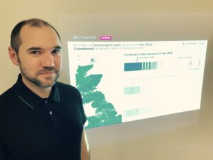
Certainly. Within my Data Science Hub we have been working on Churchill; a web application using data visualisation to connect policy makers to open data.
Catherine talked about the statistical publication redesign, recent examples include Employment Support Allowance: Work Capability Assessments, Mandatory Reconsiderations and Appealsand Universal Credit.
Adam mentioned his interactive statistical products which have been on Fraud and Error in the Benefit System, Personal Independence Payment and National Insurance Number registrations.
Also we have introduced several new features in Stat-Xplore, DWP’s online tool for the dissemination of statistics, including a new interactive mapping capability for visualising results from geography fields.
I would also encourage you to take a look at Visual.ONS (and follow the folks at @ONSDigital).
Comment by Vikas Dhawan posted on
Ryan - thanks for this interesting article. Could you advertise if you host any events in this space for those outside DWP please?
Comment by Ryan Dunn posted on
Hi Vikas,
We are currently considering how best to share material with those who are interested outside of DWP.
However, the brilliant Government Statistical Service Good Practice Team hold regular training and events for wider Government, in particular on Effective Graphs and Tables in Official Statistics.